Mario Kart World dev discusses how the map was designed
What was it like designing the map for Mario Kart World? One Nintendo developer who worked on the game has shared some insight.
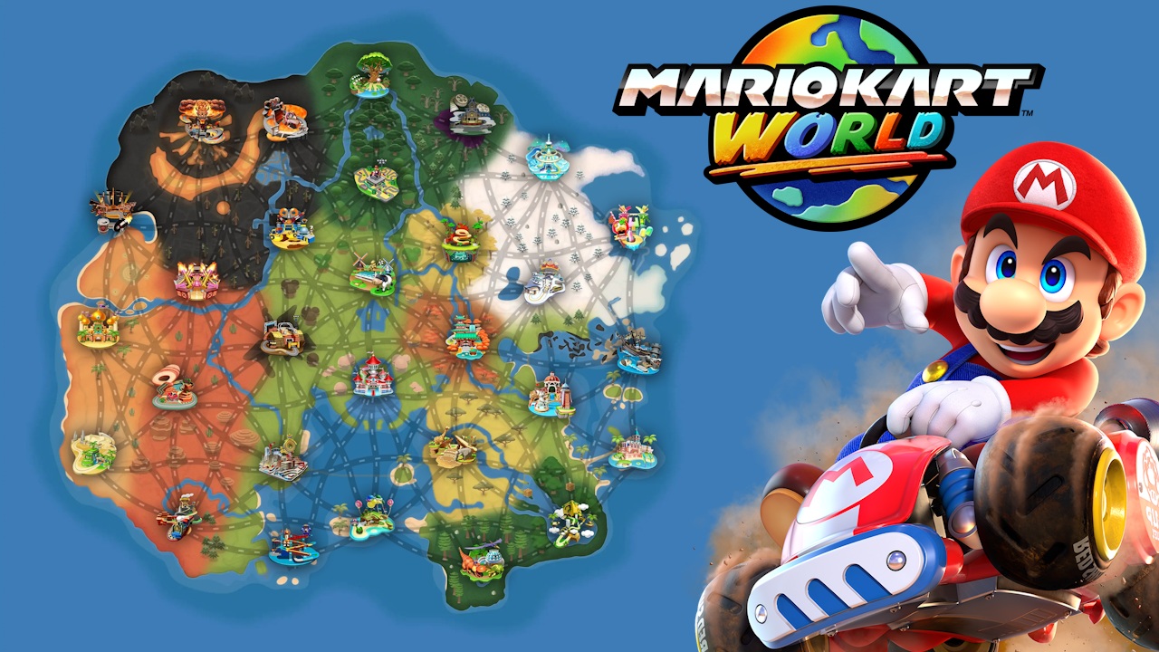
A member of the planning and development division wrote up a post on the company’s recruitment site. Now that Mario Kart has a world that can be explored, “UI that would allow players to intuitively understand this vast world was necessary.”
Nintendo designed the map so that tracks, roads, and land would be noticeable in that order. The team also “focused on making it easy to recognize tracks in one look.” After that, Nintendo “captured every track with palm-sized miniatures, and explored using a combination of dioramas and stylized art to create the icons.”
Here’s our translation of the full piece:
The Vast World of Mario Kart World
Ever since joining the company, I have been involved in the UI/UX design of various titles, including Wii Fit Plus, Mario Kart 8 Deluxe and The Legend of Zelda: Tears of the Kingdom. The things that were most important to me throughout these times were to never forget my playful spirit, and my pursuit of UI as a UI/UX designer with ‘presentation that could explain a situation at a glance’ and design that is comfortable to keep playing with’ as the main foci.
This time in Mario Kart World, which I was involved with as a UI/UX designer, instead of ‘individual tracks’ like Mario Karts of the past, the gameplay being considered was driving around freely in ‘a wide, connected world’. Therefore, UI that would allow players to intuitively understand this vast world was necessary. Thus, I became responsible for producing ‘a map that represents the world’.
Creating a Map that can Convey the World
Putting elements from the game into a map directly would cause the amount of information to be enormous. Players would not be able to quickly grasp ‘where they are’ and ‘where to go next’, and would not be able to focus on the gameplay. That’s why we designed it so that when you look at the map in its entirety, the track icons would be the first to catch the eye, then the roads connecting them would become apparent, and finally the atmosphere of the land would be conveyed, so the order of noticeability was “tracks -> roads -> land”.
First off, we aimed for presentation that would make one think ‘I want to go to this track’ when looking at the map. I like the excitement from the moment I select a track. To prevent damaging that experience, we focused on making it easy to recognize tracks in one look. However, there is a limit to how much of the track we can fit into a small icon. So, we captured every track with palm-sized miniatures, and explored using a combination of dioramas and stylized art to create the icons. We repeatedly conversed with the art director and track creators, and carefully listened to them for the key elements of the tracks. On top of that, we drove through each track many times, making note of the spots that left the deepest impression, and organized the elements between those that were going to be drawn and those that were going to be dropped. In order to adhere to the order of noticeability, we adjusted the balance of brightness, saturation, contrast and density of detail over and over, and confirmed the presentation of the entire map.
We finally completed the map, but we felt that there was still room to make it contribute more to the game’s overall immersion. Therefore, we set up the map to work with the game’s navigation systems, and made them appear in multiple situations such as loading screens or the online voting screen, allowing players to naturally understand “where I am now”. Be it driving through a track over and over, or moving on to the next piece of gameplay, we took care that the feeling of playing Mario Kart World does not stop.
Design that Supports the Expansion of the Experience
When talking about UI, buttons and text typically come to mind. This time, I made use of the experience I developed in information design and graphic design as a UI/UX designer, and designed UI/UX of a ‘single interconnected world map’ that one could get immersed in without hesitation. After that, the map became one of the elements showcasing the game’s world, and even became merchandise. Even when players are not playing Mario Kart World, they have the chance to come in contact with the map, and an opportunity to remember the world of the game. Supporting the expansion of the experience through design is a large source of motivation for me to continue working as a UI/UX designer for Nintendo.
Mario Kart World recently received a version 1.6.1 update. You can read more about that here.
Translation provided by SatsumaFS and Simon Griffin on behalf of Nintendo Everything.